|
This piece was another one I got through fairly quickly and I'm happy with it. The cat is very central, but the middle and background help create a better composition surrounding the cat with more to look at. The depth in the background created with the trees, railing and grass allows your eyes to travel around the page. In retrospect I would like to make the side of the house a different color maybe. I would make it a color that contrast the green maybe a deeper red with hints of purple. I think it looks kind of bland and doesn't allow the cat to get his special attention. I liked the line work and my gel pen craftsmanship because I feel like the stark white makes the cats fur look more appealing. I would push the values in the cat even more in this piece as well. I think I stuck with the original picture too much in this piece making it not stand out as much. Another part I would add to this piece is making the cats eyes less laser like. Allison pointed out that sometimes cats look like they are wearing eyeliner, and this cat has no black underline underneath his eyes which makes them look like lasers. I'm happy with this piece overall and once I make the small changes with the eyes I know i'll be more satisfied with it. 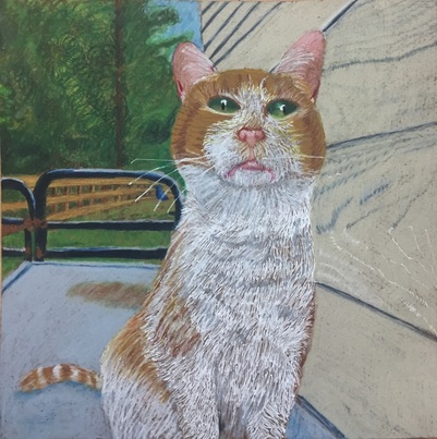
0 Comments
Leave a Reply. |
Archives
May 2016
Categories |
 RSS Feed
