|
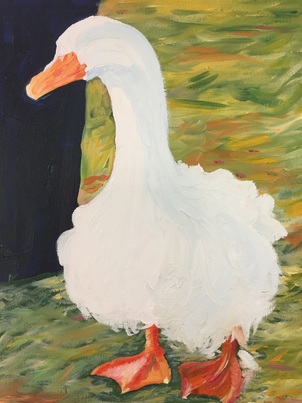
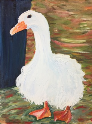
This pieces composition was much simpler compared to my previous pieces. It reminds me of my pet portrait because it appears as if Lucy was posing because she knew I was taking a picture. Compared to my other oil paintings I felt as if I grew as an artist using them because I learned how to layer properly. In the beginning I had trouble making sure the lines and Lucy's neck was proportionate compared to the rest of her body. After becoming frustrated for several minutes I decided it was time to solve this problem by printing out a picture and dividing it into sections. Spending those extra minutes mapping out the picture helps a lot. I was glad I took the time to complete this easy step because it made everything fall into place. Another problem I went through while creating this piece was using white paint to create depth. I decided that using a light blue, brown and gray would help balance the all white goose and create depth. So far my favorite part of this piece is the grass texture in the background. When I create sections like the grass I always wing it because I like the look of organic unplanned lines, especially in nature. I'm very pleased with the colors I used and I will remember that mixing and making my own greens gives me the best results. Laying down a dark green then going on top with a lighter green, yellow and orange is what made my grass texture. I think the texture and colorfulness of the grass balances the all white duck appropriately. All I need to apply is finishing touches within the feathers and the piece will be complete. I'm happy with this piece as well, it was one I knew I was going to end up painting and I'm glad to say this wasn't a let down.
0 Comments
My 5th concentration piece is another shot of panama doing what he loves most, eating. This is another composition I fell in love with because of how authentic, and organic the lines and shapes were. I'm developing my style for colored pencil more and more as I work with prismas. I'm enjoying them and I've been creating a structure/ pattern for how I layer and use them. I've found the most success with using variations of colors to create depth and to make the viewers eyes travel across the page. I struggled with the hair, and shading the highlights and making the picture look as natural as possible. Looking back I'm happy with the way it turned out, the folds of his skin and hair look good. The only thing I might go in and change is the highlights in the hair and push those values. I easy to see how far I've come when I look at older prisma colored pieces. Right now I'm in a good place and I feel like everything is rolling in the right direction. 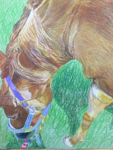 For my 4th concentration piece I went smaller than usual, and was able to recreate the ducks from another piece. In this artwork I took the same ducks I used in ordinary objects to make a concentration piece. While I was creating the piece I began to realize how quickly I can finish pieces if I put my mind to it. I’ve grown as an artist using colored pencils and I’m proud of my growth. I feel as if I can create a quality piece under pressure and under strict time constraints which resembles real life situations. I think the strict deadlines have made me push myself to become more disciplined and structured in how I work. I understand that art can be a fun class but also very challenging. I’m thankful to have a teacher like Mrs. Rossi who is able to push us because she knows how far we can go. Real life includes deadlines and stress but that is part of the process and part of being an artist. It was interesting to me how the more freedom we have, the more responsibility we must take on. We have the freedom to make more mistakes but also more freedom to develop our true style and technique because we’ve been given all the tools we just need to use them. It’s also very interesting what different pieces can teach you. Like this one didn’t teach me anything about technique but it taught me about deadlines and pressure; which is just as important as any other artistic technique. I’m happy with the overall product, it isn’t one of my favorites but it’s very simple but colorful. I need to change my palette after I created several pieces involving lots of browns. 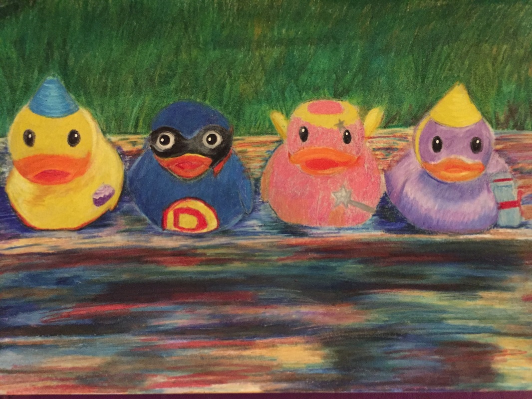 When I took this picture I never thought that I would use it as a piece for art. Looking back on every photo I took from this summer refreshed my mind, and I realized how much I liked the picture I took. I thought it was interesting that each chicken was looking a different way. I’m glad I threw a snapchat filter on the picture as well because it brought out the black of the chicken as dark blues. it made it easier to venture outside the comfort of creating what exactly on the page. I started with the smaller chickens in the back and once I got to the bigger chicken in the front I was tired of my piece. I’m very happy with the chickens in the back but I feel like the front chicken lacks detail in comparison to the others. I wish I took them to scale and size my piece making sure everything was in its place but I wanted to get started right away and I didn’t take the time to do that. In retrospect it the proportions aren’t completely off but I think taking the time to break my piece into section will improve the quality of my art. Overall I’m happy with the piece and glad I didn’t put in the fencing separation the chickens that was in the original picture. Without the fencing I think the viewer is able to really appreciate and absorb the chicken’s features. I also liked my usage of depth and my ability to use all parts of the page. This piece has depth because there are several chickens on different planes and the background of fencing adds even more to it. This piece might end up being one of my favorites. 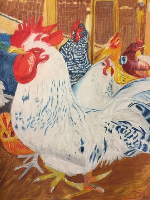 |
Archives
May 2016
Categories |
 RSS Feed
