|
Throughout the years art 4 and ap art took me on an emotional roller coaster. There was times where I hated my art and times where I was in awe with what I created. I’m thankful I was able to create all these pieces and progress as an artist in such a short amount of time. Through my concentration pieces and my breath its obvious how much I’ve grown as an artist. As I’ve come to a close with my senior art career I think back on Freshman year and how I didn’t even put art as my main course choices, it was an alternate. I’ve never regretted taking art each year and I’m glad I’ve found a subject to be passionate about. It’s helped me as a student and an artist. My usage and understanding of design principles and elements has grown with the course as well.
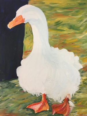
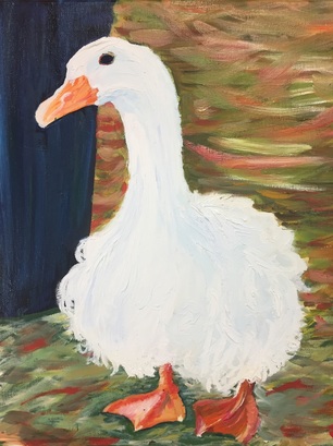
Somethings I’ve taken from the course is TIME MANAGEMENT if future ap art students can master this they will have no problems. When you’re able to manage the time you spend in class and understand what you’re capable of early on this will limit the amount of stress you feel. What I’ve gathered from my peers is that most of them work best in a low stress environment and are able to put forth their best work when they aren’t stressed out. Some stressors I encountered were due to my time management skills and I learned that they could improve. Compared to a lot of my peers I was in a pretty good shape early on so I wasn’t as stressed while I created my concentration pieces. I think my lack of stress helped me create solid quality pieces and it helped me branch out and try bigger paper sizes and harder compositions. Overall the difficulty of this course has taught me a lot about what kind of worker I am and what I need to create successful pieces. For my very last piece I wanted to make it something memorable. I had a lot of time on my hands so I took a dive into oil paints once again. This was one of the pictures I took that I knew right away that i wanted recreate. I think it was the red bars that made it for me. I worked pretty quickly on this piece and I was surprised on how far I've come with my speed and quality in not just prismas but oil paints as well. The whole time I was creating each aspect of the photo I wanted to start with the red bars but they were in the foreground so I knew if i wanted my layering to turn out properly I had to be patient. Patience was something I had to relearn and something I forgot about when I chose to do oils. While I waited on specific parts of the painting to dry I touched up other oil painting like Lucy the goose and my very first concentration piece with the "Keep Out" sign. At first I struggled with the ground and creating the appropriate texture but then I used the same blending technique I used in the painting of Lucy and I was very happy with the outcome. I think the blended messy texture is a good contrast between the meticulous repetitive tree leaves. Overall this isn't one of my favorites like I expected but I enjoyed seeing the growth within myself as I created my very last concentration piece. 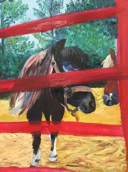 When I created this piece I was pretty far ahead. I went slightly bigger with this one compared to the others and I chose a piece that would really highlight the texture of pumpkin. I wanted this up close shot because I wanted to see if I could handle making the lines and the textures with prismas like I was able to with oil paint on my pet portrait. I think this piece is similar to the other cat and the pieces with biscuit because the background pulls everything together. I accomplished the contrast and line work I was trying to achieve in the other cat piece. The background with the couch is blue and it compliments the orange within the cats fur making it more appealing. I used a deep red in each ground to make the viewers eyes travel across the entire picture. It was only weeks after creating the piece that Jessica brought it to my attention that Pumpkin looks like he's trying to take a selfie, with heightens the personality of the cat. With the colors, eyes and the composition I was able to capture an accurate portrait of Pumpkins personality and I'm very pleased with it. 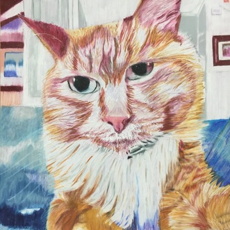 This piece was another one I got through fairly quickly and I'm happy with it. The cat is very central, but the middle and background help create a better composition surrounding the cat with more to look at. The depth in the background created with the trees, railing and grass allows your eyes to travel around the page. In retrospect I would like to make the side of the house a different color maybe. I would make it a color that contrast the green maybe a deeper red with hints of purple. I think it looks kind of bland and doesn't allow the cat to get his special attention. I liked the line work and my gel pen craftsmanship because I feel like the stark white makes the cats fur look more appealing. I would push the values in the cat even more in this piece as well. I think I stuck with the original picture too much in this piece making it not stand out as much. Another part I would add to this piece is making the cats eyes less laser like. Allison pointed out that sometimes cats look like they are wearing eyeliner, and this cat has no black underline underneath his eyes which makes them look like lasers. I'm happy with this piece overall and once I make the small changes with the eyes I know i'll be more satisfied with it. 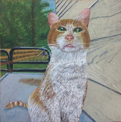 This was another interesting piece to create because it was another unconventional animal. In this piece is a picture of a lamb named BJ. BJ is frolicking in the grass and my favorite concept of this piece was how well the black of his fur contrasted with the green grass. Looking at the original picture I was very apprehensive because of how much grass there was. As I got started it wasn't as much of a problem. I decided to have fun with the grass adding in dark greens, lime greens, blue, and salmon. I think I could have pushed the values with in the grass even more but I'm happy with the end product. I would add more purple in the grass and BJ I think the purple would add more dimension to the piece. I would so maybe add more orange within the yellow flowers to create more depth. Overall the contrast in this piece is something I'm very proud of. When I created this piece I was in a good place with my art and I felt like I'd finally gotten comfortable with prismas. I became faster with them without loosing quality and I was happy with my layering techniques. 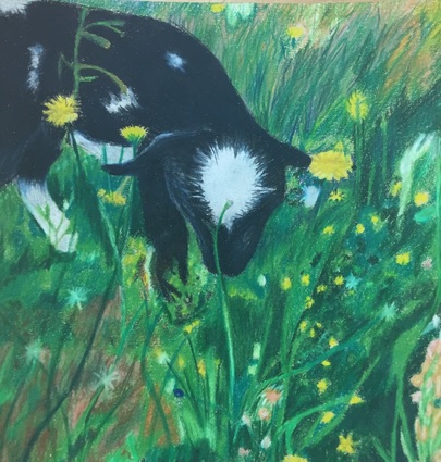 This piece is one of my favorites because of the overall feeling that I was able to capture through the composition, colors and the subject. I really enjoyed constructing this piece because it was just so cute. Biscuit looks very soft and harmless. He looks this way because of my usage of lines and colors. The soft but clean lines gave the soft textured appearance I was trying to portray. I think the fact that I brought some of the fur down into his eyes, and the highlights on his snout make you want to look at him for longer. I'm also glad I put in the background elements because having a background always adds to the composition making it more interesting. The fact that this is also an older picture of biscuit makes it that much cuter. 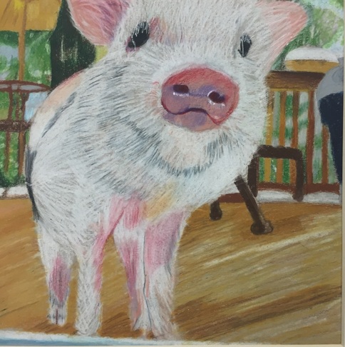 For my 7th piece I decided to draw biscuit. Biscuit is a friendly smart pet pig that Tania cares for. In this picture biscuit is outside on the deck looking into the house through a glass screen door. When I created this piece I was very excited about it because its unconventional to have a pet pig and I liked the composition at the time. In retrospect there were better compositions of Biscuit but I settled on this one because I was drawn toward all the items within the background. I liked how layered the picture appeared. I'm happy with my choice to use a white colored pencil instead of a white gel pen for the hairs because, his hairs are softer and less defined unless you are very close. I was able to create texture and softness with just a white colored pencil. This piece has showed me how much better I've gotten at creating textures on a flat surface and creating dimension. I think the values within his snout made the biggest difference in the various layers within the picture. It appeared closer to me, which it should be. I just remember early on in my art career I would struggle with creating dimension using values and its cool to see my growth in something like this even if it is as small as whiskers and a snout. 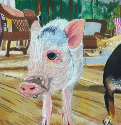 This pieces composition was much simpler compared to my previous pieces. It reminds me of my pet portrait because it appears as if Lucy was posing because she knew I was taking a picture. Compared to my other oil paintings I felt as if I grew as an artist using them because I learned how to layer properly. In the beginning I had trouble making sure the lines and Lucy's neck was proportionate compared to the rest of her body. After becoming frustrated for several minutes I decided it was time to solve this problem by printing out a picture and dividing it into sections. Spending those extra minutes mapping out the picture helps a lot. I was glad I took the time to complete this easy step because it made everything fall into place. Another problem I went through while creating this piece was using white paint to create depth. I decided that using a light blue, brown and gray would help balance the all white goose and create depth. So far my favorite part of this piece is the grass texture in the background. When I create sections like the grass I always wing it because I like the look of organic unplanned lines, especially in nature. I'm very pleased with the colors I used and I will remember that mixing and making my own greens gives me the best results. Laying down a dark green then going on top with a lighter green, yellow and orange is what made my grass texture. I think the texture and colorfulness of the grass balances the all white duck appropriately. All I need to apply is finishing touches within the feathers and the piece will be complete. I'm happy with this piece as well, it was one I knew I was going to end up painting and I'm glad to say this wasn't a let down.
|
Archives
May 2016
Categories |
 RSS Feed
